Friday, 30 November 2012
Friday, 23 November 2012
Tutorial videos I found effective.
This is a tutorial video on how to 'fracture' images through photoshop. I tried out this effect on my poster photo of the pig mask, after feedback from my target audience it proved to be very effective and eye catching.
I attempted to use it on the digipak photos as well, however the size and colour of the photos meant that the effect was made to look quite cheap and sloppy.
Monday, 12 November 2012
Photography Techniques
We decided that the best way to incorporate this in to our video would be to use fast pace editing. Before going to London we did a test run in the college car park.
Print Research Magazines
![]() |
This advert is from Q magazine, promoting Bombay Bicycle Clubs new album. The imagery is consistent with that of the album cover, black and white imagery of a park with blue text in different fonts. It has a washed out look, which is consistent with the genre. It features the name of the band, the album title, most recent song releases, 'out now' in bold and the bands website at the foot of the advert. This is all used to intrigue the bands current audience. For new audiences the genre of the band is clear, the use of over exposed imagery and other such features makes it really clear. This is opposed to adverts for artists such as Rihanna's, which is full of colour, 'in your face' type of advert.
The Horrors, Strange House advert found in Kerrang Magazing, is an example of how bands use the colours and expression of imagery in adverts to convey the overall mood of the music. The black and white theme and the bands blank expression gives off a serious and dark vibe, clearly not a jumpy, dance, love and happiness vibe like Rihanna's. Like BBC's advert, the band's name and album title are the most noticeable in large bold lettering,they also emphasise the release date. An additional feature of The Horrors advert is the use of critique quotes, this gives the audience a sense of the bands confidence in the album.
Print Research Digipaks
To gain a better understanding of how digipaks are used as a means to sell music. When researching the Brit Pop genre, I have found that bands tend to use digipaks for aesthetic reasons.
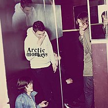
The Arctic Monkeys and Oasis' digipaks have been interesting to look at, as they both were made more than 10 years apart. Both covers have many similarities, they share the use of effects, which is often seen with this genre. For example, the Oasis cover is over exposed and uses a washed out effect. This can create an overpowering, hazy light that is reminiscent of looking in to the sun. It can also be used as a way to brighten up a mundane scene, which often the front covers of 'indie' type CD's are. The Arctic Monkeys 'Humbug' also uses these effects.
A second similarity between the Brit Pop artists digipaks is the use of imagery. Although the Arctic Monkeys digipak features the band on the front, it is not clear, the use of mirrors, shadows and disjointed imagery makes it entropic. It could connote that the band are taking a darker more experimental route with their music, but it isn't clear. Oasis use a similarly entropic image, and this is seen mimicked across the genre.
Another common feature is the way in which the album title is - or isn't - displayed. Bands sometimes only put their name to the CD, but not the CD title, for example Humbug. Oasis have displayed both titles, however the band name is in a banner of its own, it stands out. The title is white against a bright background. A lot of bands don't put anything on the front, just imagery.
Disc ImageryA second similarity between the Brit Pop artists digipaks is the use of imagery. Although the Arctic Monkeys digipak features the band on the front, it is not clear, the use of mirrors, shadows and disjointed imagery makes it entropic. It could connote that the band are taking a darker more experimental route with their music, but it isn't clear. Oasis use a similarly entropic image, and this is seen mimicked across the genre.
Another common feature is the way in which the album title is - or isn't - displayed. Bands sometimes only put their name to the CD, but not the CD title, for example Humbug. Oasis have displayed both titles, however the band name is in a banner of its own, it stands out. The title is white against a bright background. A lot of bands don't put anything on the front, just imagery.
Disc imagery is common throughout the Brit Pop genre. The picture on the disc usually relates to the front and back cover, developing a theme. The Oasis 'Whats The Story Morning Glory' disc is the back of a mans head. This relates to the front cover, as you see a man walking away from the camera. Its plain, simple, but effective. It features the track listings at the bottom of the disc, and the name of the band and CD at the top. The record, production and distribution companies are also written around the sides. The Arctic Monkeys disc is just a pie with AM baked on to the top. This imagery is used to connote that the band are quite normal and down to earth, something that their audience will go to the pub to get for a meal, they share the love of too.
Back
The backs of the digipaks keep up the theme. Oasis' shows the man from the front cover, just in a different setting. The Arctic Monkey's CD is plain, but fits in with a colour scheme. The title and band name is featured, along with a track listing and bar code. Theirs features the label, production and distribution on the back as opposed to on the disc.
Saturday, 10 November 2012
Pitch Feedback
After pitching our music video to the rest of the group and looking through the feedback we were given, the main concern was "Could you have difficulties taking equipment such as lighting/cameras to London?" We have re-considered the equipment we'll be using because of this, and have decided that for the shots filmed in London we will use hand held cameras and small LED lights. These are easy to transport on the coach without getting damage, and also easy to use on the bus/tube locations.
One other issue that cropped up was "Do you need permission to film in a tube station/on a bus?" We have looked into this, and although we would need to apply for a £50 permit to film on public transport, we are free to photograph in these locations. Taking this into consideration, we have decided that any shots on a bus or tube station will be done with stop motion photography. As well as fitting in with the legal permission guidelines, we all feel this will add a more interesting dimension to our video.
The rest of the feedback we received was positive and supportive of our idea, including comments such as; "Suitable for the target audience, the idea is original and different yet will still be relatable" "I like the entropy of the animal masks and am interested to see how it is put together" and "It sounds very realistic and will fit really well with your chosen genre."
One other issue that cropped up was "Do you need permission to film in a tube station/on a bus?" We have looked into this, and although we would need to apply for a £50 permit to film on public transport, we are free to photograph in these locations. Taking this into consideration, we have decided that any shots on a bus or tube station will be done with stop motion photography. As well as fitting in with the legal permission guidelines, we all feel this will add a more interesting dimension to our video.
The rest of the feedback we received was positive and supportive of our idea, including comments such as; "Suitable for the target audience, the idea is original and different yet will still be relatable" "I like the entropy of the animal masks and am interested to see how it is put together" and "It sounds very realistic and will fit really well with your chosen genre."
Friday, 9 November 2012
Pitch Prezi
This Prezi was made to assist us in presenting our pitch to 'sell' our music video. We firstly explored the genre of Brit Pop, then went on to develop our ideas through the use of pictures.
Thursday, 8 November 2012
Location Research/Pitch Material
Today we went as a group to The Farriers Arms pub, our chosen location for photography and for some parts of the music video. We spoke to the manager about our intentions and he was happy for us to film and photograph whenever we wanted. Whilst we were there we purchased some packets of pork scratchings to share around the class when we pitch tomorrow, as it will give a feel for out genre/theme for our video. We also want to feature pork scratchings in our print work and video.
Subscribe to:
Posts (Atom)