To gain a better understanding of how digipaks are used as a means to sell music. When researching the Brit Pop genre, I have found that bands tend to use digipaks for aesthetic reasons.

 CD Covers
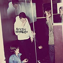
The Arctic Monkeys and Oasis' digipaks have been interesting to look at, as they both were made more than 10 years apart. Both covers have many similarities, they share the use of effects, which is often seen with this genre. For example, the Oasis cover is over exposed and uses a washed out effect. This can create an overpowering, hazy light that is reminiscent of looking in to the sun. It can also be used as a way to brighten up a mundane scene, which often the front covers of 'indie' type CD's are. The Arctic Monkeys 'Humbug' also uses these effects.
A second similarity between the Brit Pop artists digipaks is the use of imagery. Although the Arctic Monkeys digipak features the band on the front, it is not clear, the use of mirrors, shadows and disjointed imagery makes it entropic. It could connote that the band are taking a darker more experimental route with their music, but it isn't clear. Oasis use a similarly entropic image, and this is seen mimicked across the genre.
Another common feature is the way in which the album title is - or isn't - displayed. Bands sometimes only put their name to the CD, but not the CD title, for example Humbug. Oasis have displayed both titles, however the band name is in a banner of its own, it stands out. The title is white against a bright background. A lot of bands don't put anything on the front, just imagery.
Disc ImageryA second similarity between the Brit Pop artists digipaks is the use of imagery. Although the Arctic Monkeys digipak features the band on the front, it is not clear, the use of mirrors, shadows and disjointed imagery makes it entropic. It could connote that the band are taking a darker more experimental route with their music, but it isn't clear. Oasis use a similarly entropic image, and this is seen mimicked across the genre.
Another common feature is the way in which the album title is - or isn't - displayed. Bands sometimes only put their name to the CD, but not the CD title, for example Humbug. Oasis have displayed both titles, however the band name is in a banner of its own, it stands out. The title is white against a bright background. A lot of bands don't put anything on the front, just imagery.
/(1995)Whats%20The%20Story%20Morning%20Glory/Covers/Oasis-Whats-The-Story-Morning-Glory-[Cd].jpg)

Disc imagery is common throughout the Brit Pop genre. The picture on the disc usually relates to the front and back cover, developing a theme. The Oasis 'Whats The Story Morning Glory' disc is the back of a mans head. This relates to the front cover, as you see a man walking away from the camera. Its plain, simple, but effective. It features the track listings at the bottom of the disc, and the name of the band and CD at the top. The record, production and distribution companies are also written around the sides. The Arctic Monkeys disc is just a pie with AM baked on to the top. This imagery is used to connote that the band are quite normal and down to earth, something that their audience will go to the pub to get for a meal, they share the love of too.
Back
The backs of the digipaks keep up the theme. Oasis' shows the man from the front cover, just in a different setting. The Arctic Monkey's CD is plain, but fits in with a colour scheme. The title and band name is featured, along with a track listing and bar code. Theirs features the label, production and distribution on the back as opposed to on the disc.


No comments:
Post a Comment